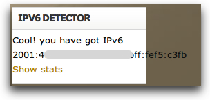
Rather ironically, I have found that the WordPress theme I’ve been initially using for this site demonstrates perfectly the kind of user interface display issues that will bite so many developers with IPv6. Here’s a screenshot of me visiting the site from an IPv6 site (part of the address covered for security purposes):

As you can see, it goes well outside the column containing the box with the address in it.
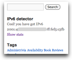
In contrast, over on Code.DanYork.com I’m using a different theme and the same exact widget displays the IPv6 address fine there:

The big difference is the style sheets use a smaller font size and the column is also bigger.
I’m not too worried about the display here in the current theme because I’m going to be changing the theme for a couple of reasons (it may even have changed already by the time you read this post). But it serves as precisely the kind of user interface issue that application developers will need to examine.